
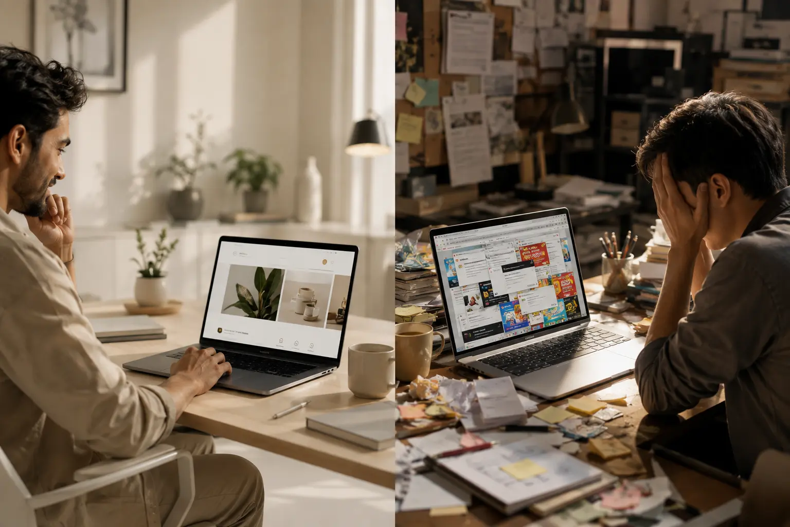
Your First Impression Happens Fast
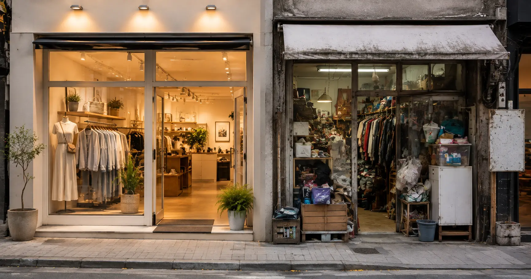
Imagine walking into a shop.
The entrance is clean.
The products are neatly arranged.
Someone welcomes you with a smile.
You instantly feel comfortable.
Now imagine another shop.
Things are scattered everywhere.
Nothing is labelled.
Nobody is there to help.
Most people would walk out.
A website creates the same feeling.
People decide within a few seconds whether they want to stay or leave.
A clear first impression makes all the difference.
People Shouldn't Have to Think
The best websites don't make visitors guess.
People should immediately know:
What you do
Who you help
What they should do next
If someone has to search for basic information, they'll often leave.
A good website answers questions before people even ask them.
The easier it feels, the longer people stay.
Clear Words Beat Clever Words
Many businesses try to sound impressive.
They use complicated words.
Fancy headlines.
Long explanations.
But most visitors aren't looking to be impressed.
They're looking to understand.
Simple words build confidence.
When people understand you quickly, they trust you more.
Clarity will always win over complexity.

Too Many Choices Create Confusion
Have you ever opened a restaurant menu with hundreds of dishes?
Instead of making the decision easier, it becomes harder.
Websites work the same way.
Too many buttons.
Too many menus.
Too many pop-ups.
Too many offers.
People stop exploring.
Good websites help visitors focus on one step at a time.
Sometimes, less really is more.
Speed Changes Everything
Nobody enjoys waiting.
If a website feels slow, people often leave before it even finishes loading.
Think about standing in a long queue.
If another shop next door has no queue, where would you go?
Online visitors think the same way.
A fast website shows respect for people's time.
And people appreciate that.
Trust Is Built Through Small Details
Trust doesn't come from saying,
"We're the best."
It comes from showing people they can believe you.
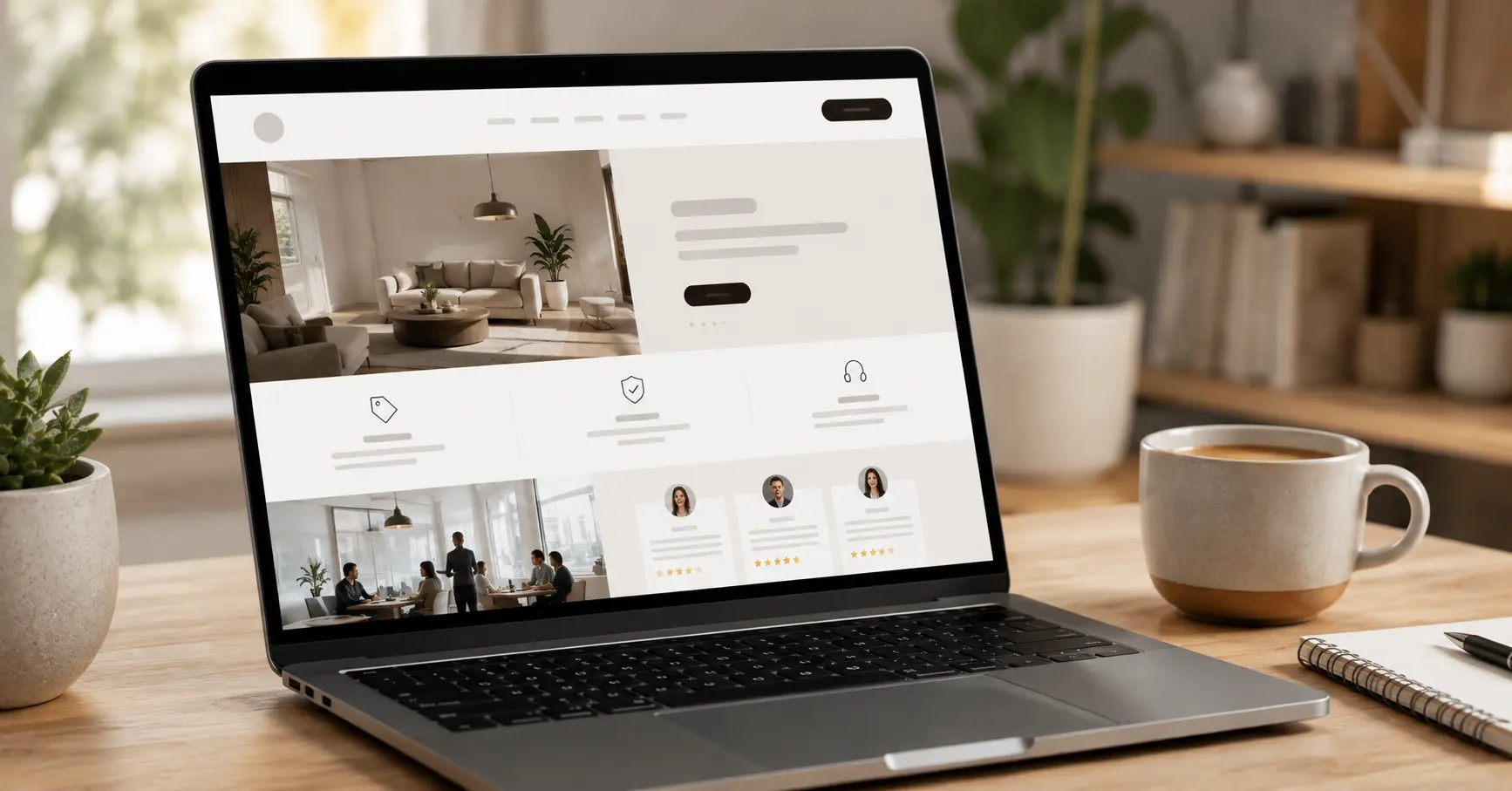
Small details make a big difference.
Things like:
Clear contact information
Real photographs
Customer reviews
Consistent design
Easy navigation
These details quietly tell visitors,
"You can trust us."
Good Websites Guide You Naturally
Imagine visiting a shopping mall with no signs.
You wouldn't know where to go.
A website should never feel like that.
Every page should gently guide visitors.
Where to click.
What to read.
How to contact you.
People shouldn't feel lost.
They should feel supported.
Mobile Is No Longer Optional
Think about how often you use your phone every day.
Now think about your customers.
Most of them are doing exactly the same.
If your website is difficult to use on a phone, you're making life harder for a large part of your audience.
A good website should feel just as easy on a mobile phone as it does on a computer.
Simple.
Comfortable.
Easy to use.
A Website Should Feel Like a Helpful Person
The best websites don't feel like machines.
They feel welcoming.
They answer questions clearly.
They don't waste your time.
They help you move forward.
When your website feels helpful instead of confusing, people naturally spend more time with your business.
And that's exactly what every good website should do.

Final Thoughts
People don't leave websites because they're ugly.
They leave because they're confusing.
A good website doesn't try to impress people with flashy effects.
It simply makes life easier.
It helps visitors find what they need.
It answers their questions.
It earns their trust.
The easier your website feels, the easier it becomes for people to choose your business.
Because the best websites aren't the ones people notice.
They're the ones people enjoy using.
Frequently Asked Questions
What makes a website easy to use?
A website feels easy to use when people can quickly understand what your business does, find what they're looking for, and take the next step without confusion.
Why do people leave websites so quickly?
Most people leave because they can't find information easily, the website feels slow, or the content is confusing.
Does a beautiful website always perform better?
Not always. A beautiful website is helpful only when it's also simple, clear, and easy to use.
How can I improve my business website?
Start by making your message clearer, simplifying your navigation, improving loading speed, and helping visitors find important information quickly.
Key Takeaways
People decide within seconds whether to stay or leave.
Simple websites are easier to trust.
Clear words work better than complicated language.
Too many choices often create confusion.
The best websites make life easier for visitors.

Vinay Hegde
Co-Founder
Make your website the one people want to stay on.
A great website doesn't confuse people. It welcomes them, guides them, and helps them find what they need with ease. If you're ready to create a website that's simple, clear, and memorable, let's start that journey together.
Related Posts

Spacio Workspace,
No 7, Sree Devi Complex, NAT Street Bangalore - 560004, Karnataka, India
1st Floor, Kadamba Marketing Market Yard, Sirsi Tech Park, Sirsi, Karnataka 581402
No.57, Wodeyar Building, 1st Floor, Near Old Private Bus Stand, Opp Court, B.H. Road, Sagara – 577401